DNA Communications
What They Needed: DNA Communications is a Northern Illinois telecom company that was expanding their offering to include broadband internet service. Their website had been put together over many years, and lacked any sort of structure. Branding was in need of freshening to show modernity and a strong presence. The DNA message was completely lost in their old marketing materials and their confusing website design.
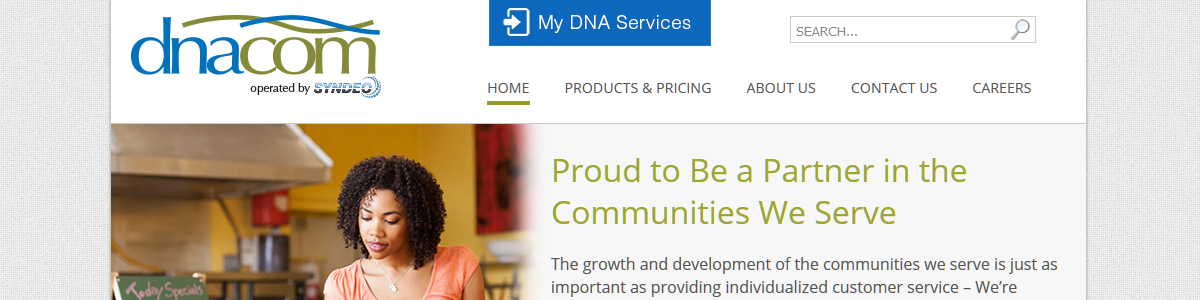
The owners felt a blue and green color scheme would best represent their commitment to the environment and offer them a fresh “style”. They wanted to use imagery that conveyed a message of “small town partnership”, so their current customer base would not lose that feeling of a local connection.
The website needed a simple yet informative layout…making it easy for customers to make choices that fit their needs.
What We Did:
- Redesigned their website to use a fresh and light color scheme, so their new logo and imagery would stand out.
- Restructured the website to make navigation easier.
- Added pricing tables and graphics to help clients understand choices.
- Revamped their entire branding line, to include fresher, more modern graphics and messages.
- Designed new business cards, stationery, and PowerPoint slides to complete their cohesive brand.
Project Images:
[envira-gallery id=”3417″]